
Watching Type, No. 4: This week's Black Bough drop
Casting a design eye over some affordable vintage watches

Hello, and welcome back to Watching Type. This week I’m doing something a little different. Black Bough is a retailer in Ludlow in Shropshire, England, founded by Adam Withington and Alex Barter. Alex is a well-known vintage watch expert and the former director of watches at Sotheby’s, as well as being the author of the excellent book The Watch: A Twentieth-Century Style History.
Black Bough have carved out a niche in selling very attractive, midcentury, reasonably priced vintage watches – Omega, Longines, and the like – and I look forward to their email every week to see what Alex has sourced. This week’s crop was particularly strong from a design and typographic perspective so I’ve decided to take a look at some of them here.
Let me know if you enjoy this post and if you’d like me to do more like it.
Tudor Prince Oysterdate Ref. 7990-4
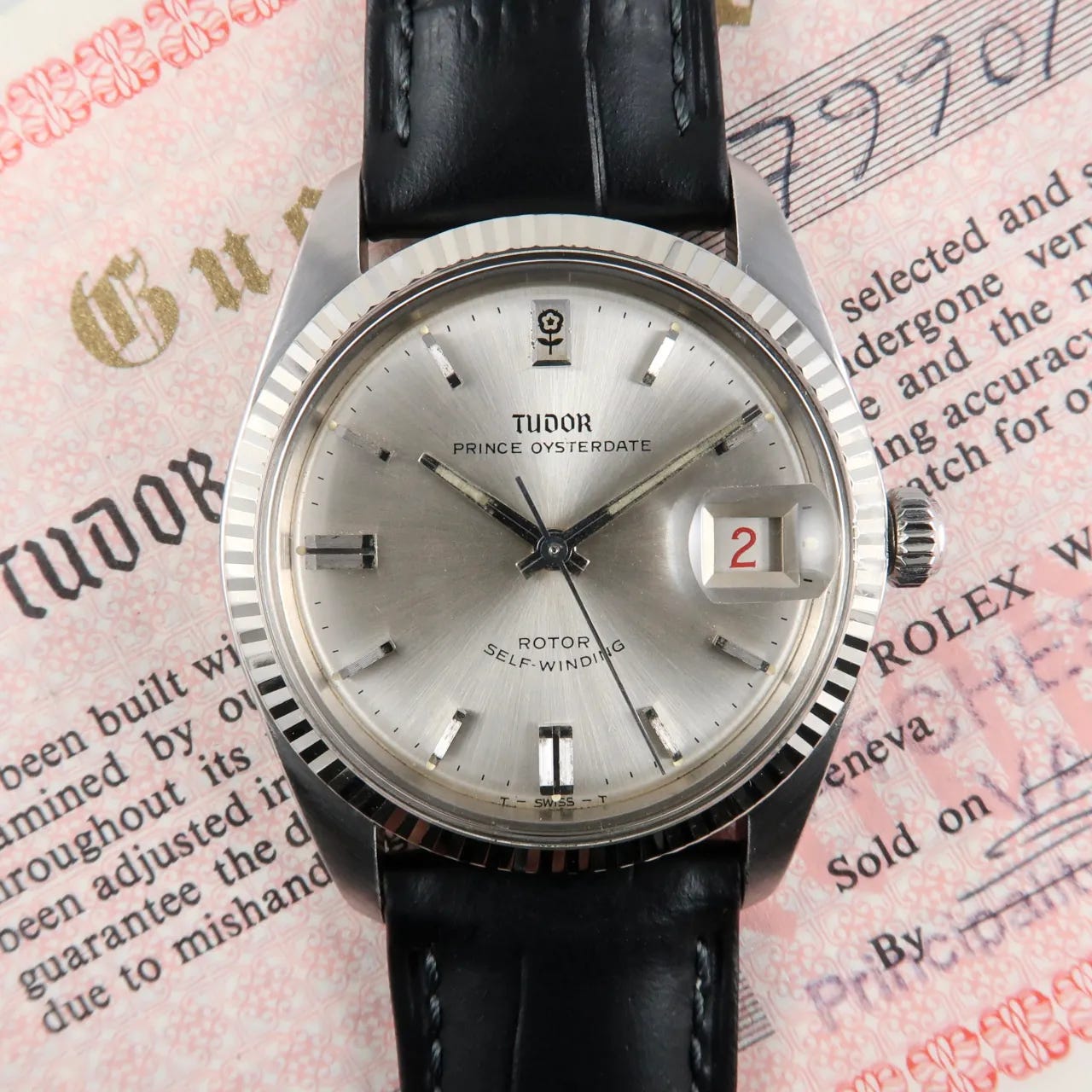
The Prince Oysterdate is of course the Tudor version of the Rolex Datejust, but this variant has some really interesting details in its own right. I really like the old blackletter Tudor logo – it’s quite distinctive and elegant in this application, and it’s a bit of a shame (if entirely understandable) that most brands that used blackletter have ditched theirs1.
The “smiley” SELF-WINDING text2 is present and correct, neatly hand rendered and with a typical flat top and bottom to the S and the G. Note also that the hyphen is drawn at the correct height for text that is all capitals, being halfway up the letter, roughly where the centre bar of the F is. If you type that out with a typical font, you’ll see the hyphen is lower. Look: F-W. That’s because hyphens usually appear in text between lower-case letters, and the font is designed to make it look right in those situations. The compromise is that it’s too low (and also a bit short) when set between capital letters3. See how many modern watches you can spot that glitch on.
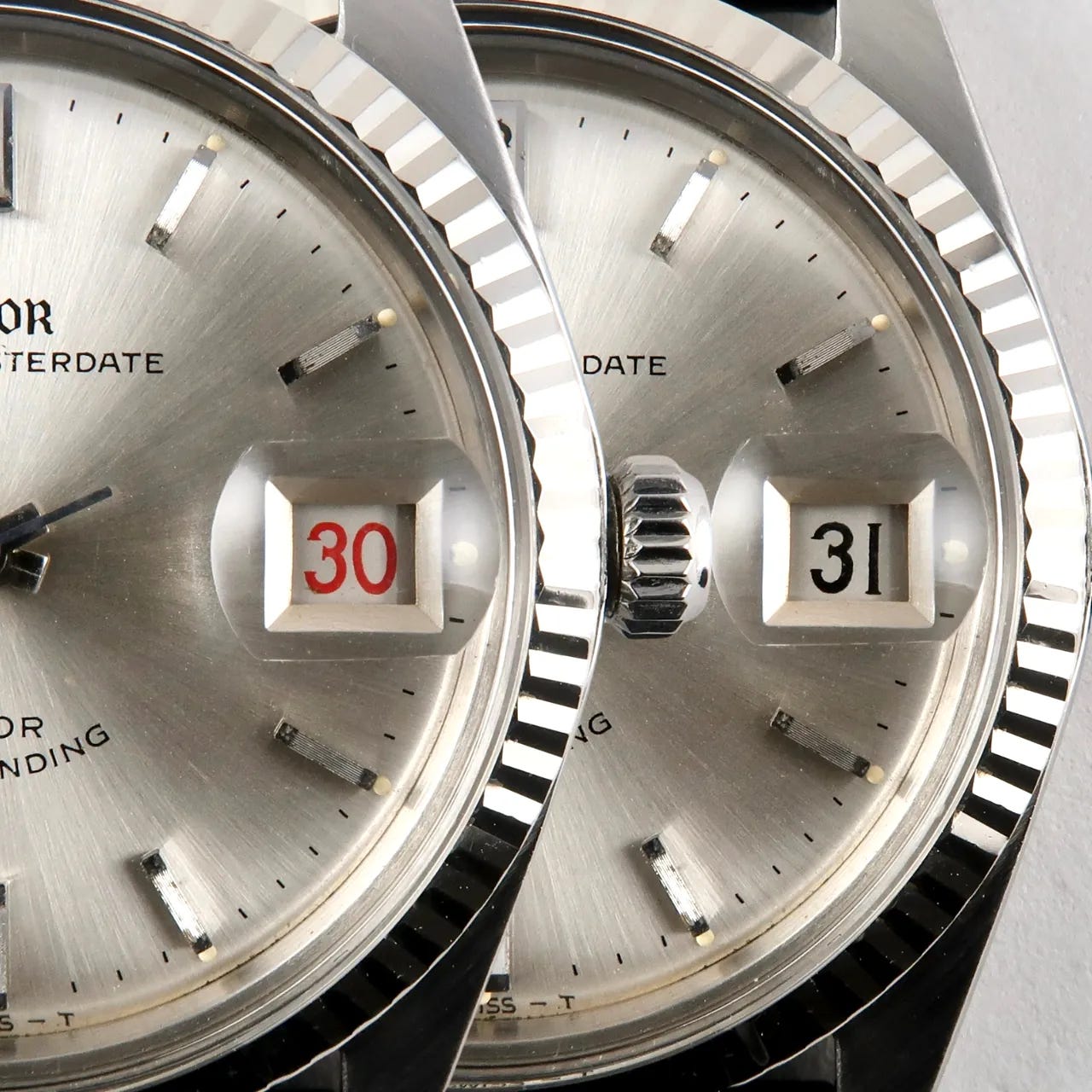
I also like the rose printed directly onto the applied 12 o’clock marker, almost like a traditional cartouche, and of course the roulette date wheel with its very curvy, squidgey 3s:
The watch is now sold but the listing can be found here.
Omega Seamaster de Ville Ref. 166.020
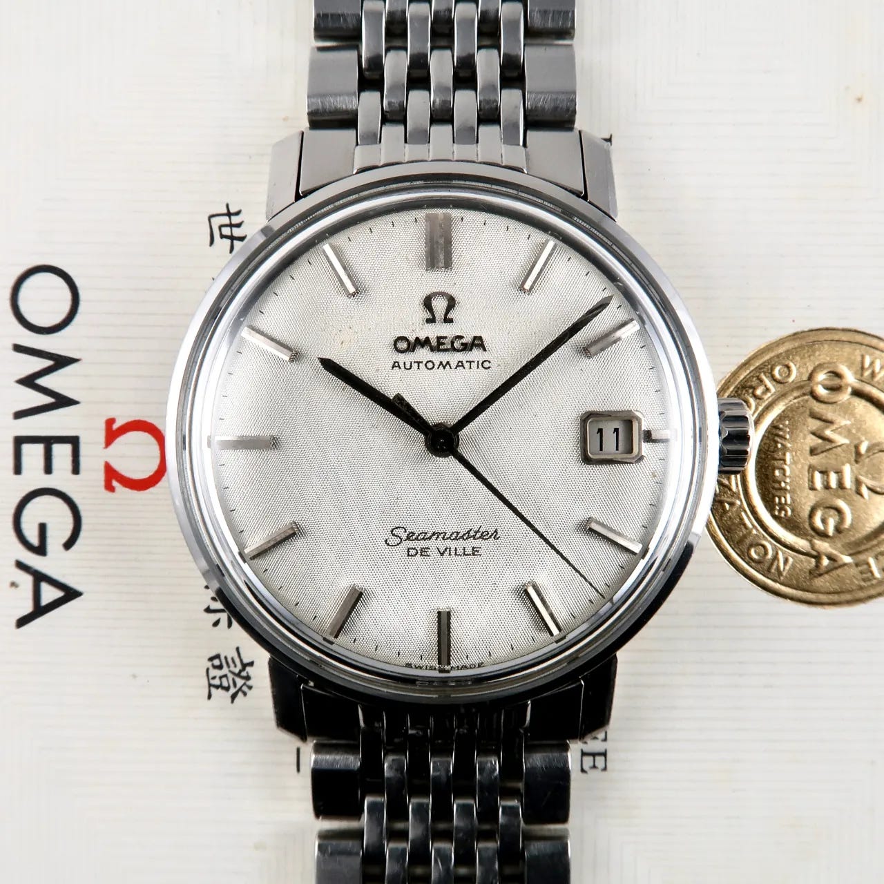
This De Ville with a lovely linen dial (the direction of the pattern is almost like a very fine waffle dial) has a couple of interesting touches. Firstly, and rather unusually, the “A” in the applied Omega logo has a flat top. Omega logos vary quite a lot until the adoption of the standardised modern Futura-based logo but they follow a fairly consistent pattern. Usually the A is pointed, which the wide pointed M then matches.
Secondly, the date numerals have a neat, sharp hook on the 1s. I like that a lot. And thirdly: look at the facets on the date window surround:
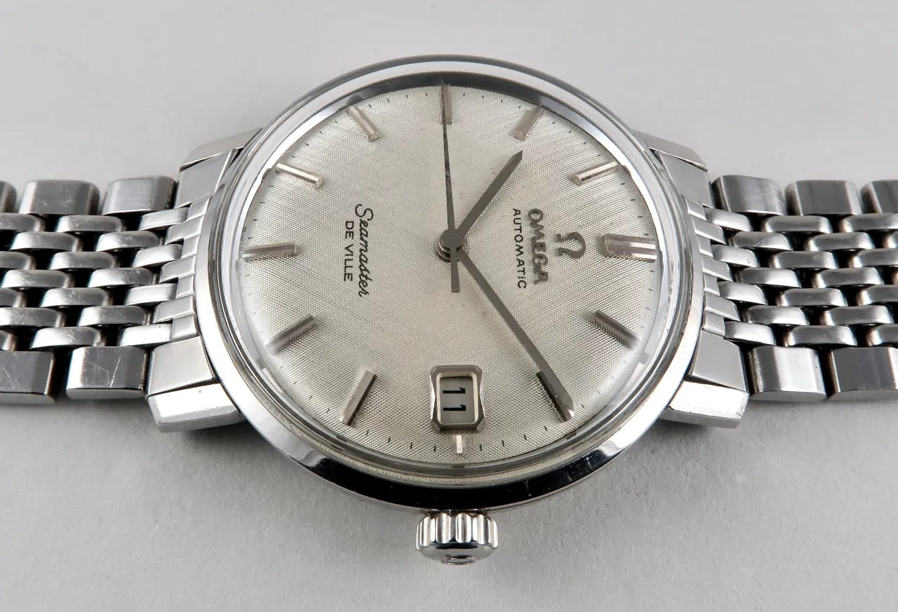
Love that. More of that sort of thing in modern watches please. This watch is also sold but the original listing is here.
Longines Ref. 7135-11
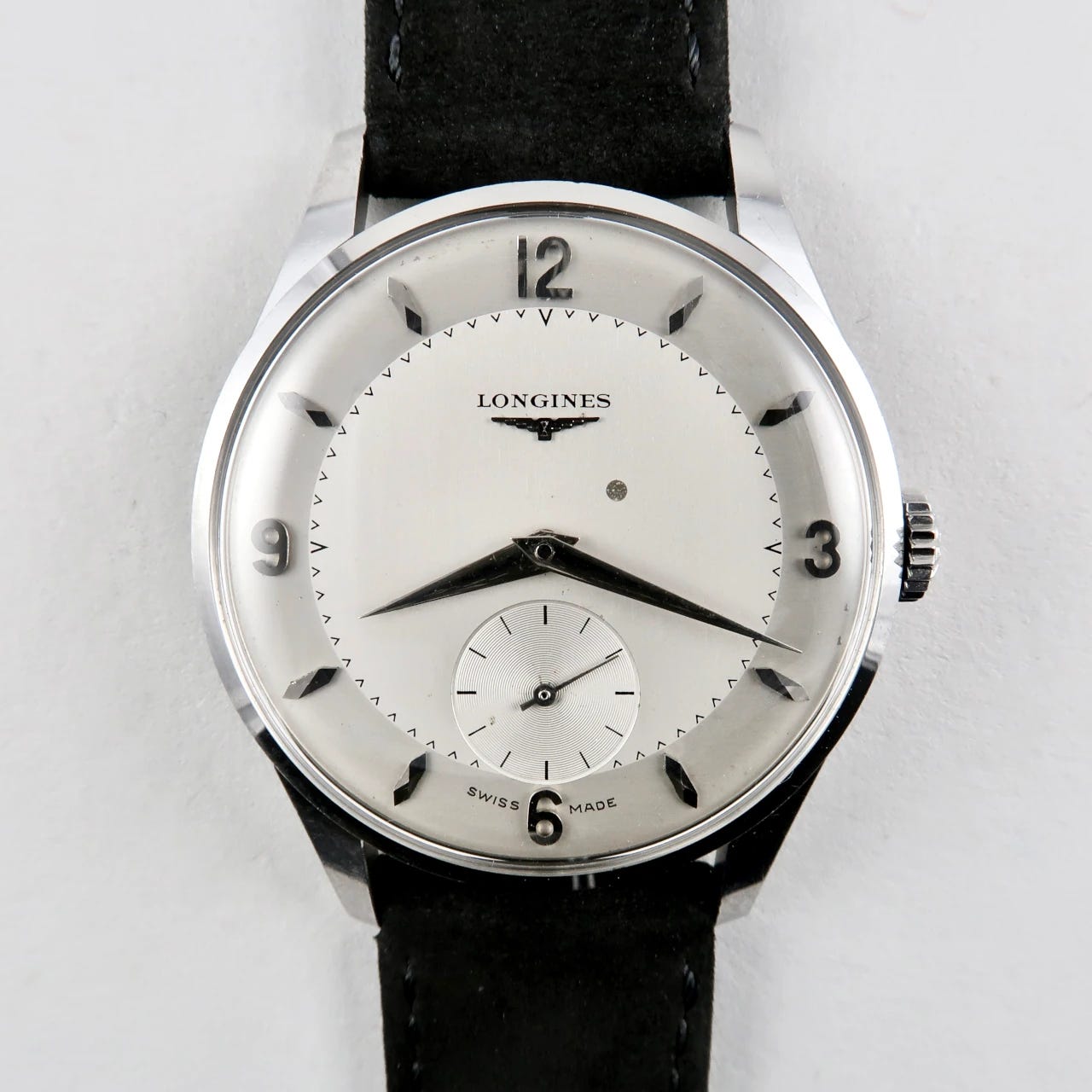
More nice facets, clean applied numerals, and the classic Longines text, but really it’s about those “caret”-shaped minute markers, something I’d not seen before.
This Longines is priced at £875 here.
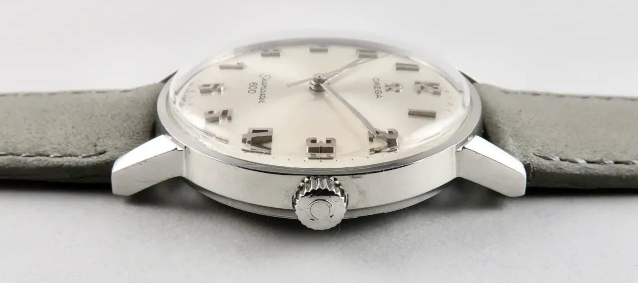
Omega Seamaster 600 Ref. 135.011
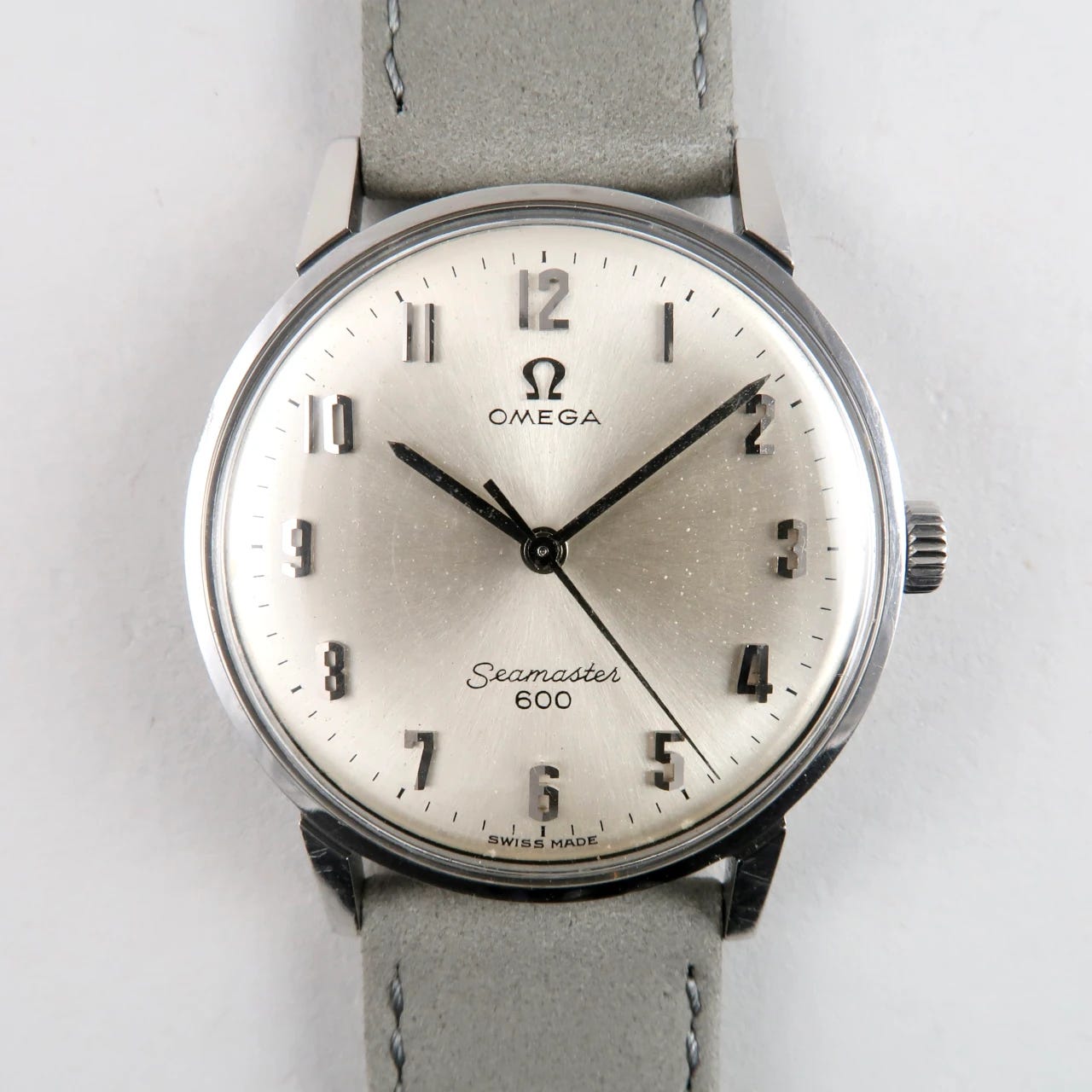
Here we see the more usual Omega logo, with the wide pointed M and A, but the stars of the show are those faceted Arabic numerals, each one angled down the middle like the peak of a roof.
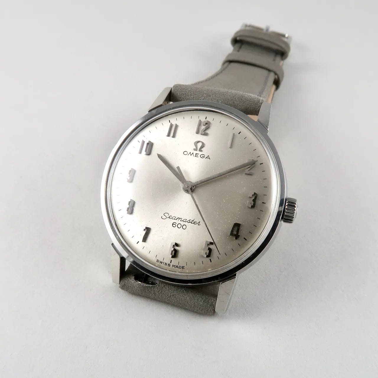
They’re also unexpectedly tall:
Everything else on the dial is neat, tidy and elegant, but the numerals really make it stand out in a sea (no pun intended) of handsome 1960s Seamasters. Black Bough have sold at least one of these before and I loved it then – I could see one in my future.
This one is also sold, but the listing is here.
Telda Triple Calendar
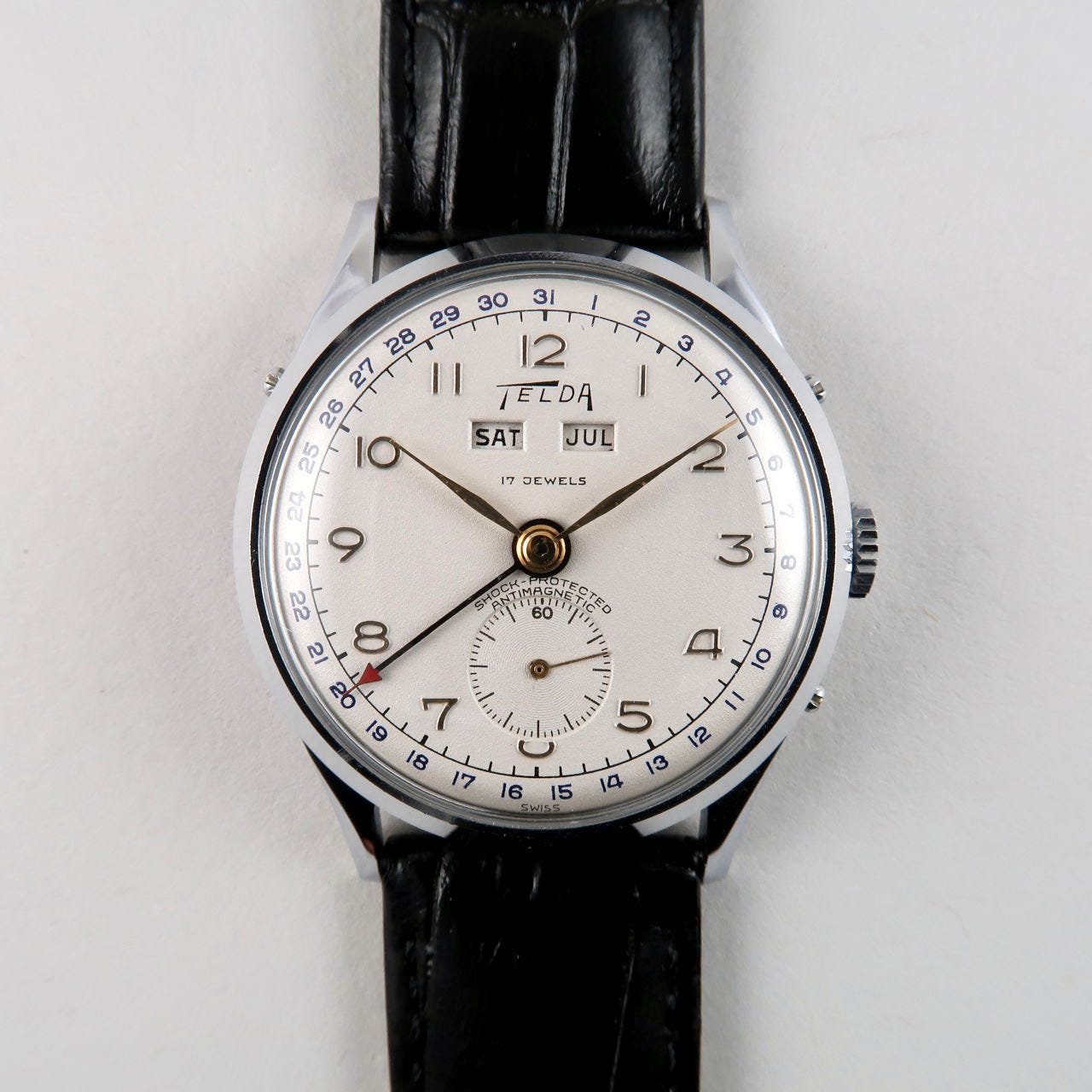
This is a bonus one: it wasn’t part of the stock update but it’s so interesting I wanted to feature it.
First, the Telda logo is quite cool and unusual, with its pointed wedge shapes and wide spacing. I’ve seen a few variants of this logo (similar to how you see many variations of the Omega logo) and this particular execution looks really good on the clean white dial.
The small text is very cleanly and neatly done for maximum legibility at the tiny sizes involved (the watch is 32mm in diameter). All the classic tricks are employed to open the letters up: hooked J, flat top and bottom S and G, flat top A, and a K with a horizontal bar. The date numerals are in a very classic style with mostly curved numbers, stick 1s and a flat top 4. The blue colour is a nice touch to differentiate them.
Possibly the nicest feature are the large Arabic numerals. They are in general slightly unusual in their form. The 4 is neither the straight-edged flat top type but also not the version that curves gently from the top right to bottom-left; it’s something in between. The hook on the 7 points back in towards the centre of the number, which you very rarely see. And also very noticeable are the 2s and the 9, which have a smooth curved top that echoes the 0 and 8, but then comes off at a straight tangent down to the bottom. It’s much more typical on both of these numerals to have a more continuous smooth curve at the bottom (as on the date numerals on the same dial). This more geometric execution helps lend it a somewhat technical, instrument-like feel that I really like.
This Telda triple calendar in NOS condition is available for £925 here.
That’s it for this week. Hope you enjoyed this look at some of Black Bough’s vintage stock – I highly recommend subscribing to their email updates as there are always some very attractive watches.
Before I go, I wanted to mention that there might be some changes to the regular weekly schedule of this newsletter over the holiday period, and possibly going forward. I’m still figuring out what format and schedule works best around my regular client work, and considering how much depth I should go into in each issue. Please subscribe for updates on that, but in the meantime I welcome any and all feedback!
See you next time,
Samuel
It’s maybe ironic that Grand Seiko – a non-European brand – are one that have persisted. I’m not sure, but I always felt that their gothic script logo was something that was intended to convey a sense of European-style heritage to GS and to make it clear that it was intending to compete head-on with the Swiss.
I’ve always assumed the curve of the “smiley” text is intended to evoke the swing of the rotor, though I have no evidence for that.
That is exactly why Grand Seiko chose the gothic script - they were impressed by and in thrall to notions of European luxury and craft, and adopted the incongruously Germanic font as a direct homage.