
Watching Type, No. 1: The 70th Anniversary Polerouters
And the rebirth of Universal Genève (so far)

Hello and welcome to the first (proper) issue of Watching Type. Thanks so much to all of you who have already subscribed; I hope you find it interesting. This instalment is likely to be a little longer than most that I put out, but I think it merits the slightly deeper dive.
Reviving the Polerouter
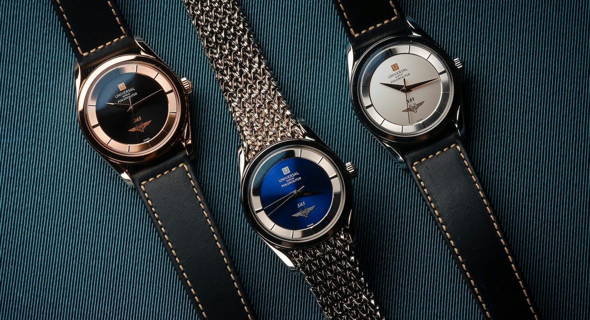
This week, the biggest news in the watch world has probably been the (somewhat unexpected) unveiling of a set of three brand new, pièce unique Universal Genève SAS Polerouters.
To summarise (if you’re not caught up with recent UG developments): in late 2023 it was announced that the dormant UG brand had been acquired by the same ownership group as Breitling, with Breitling CEO Georges Kern to oversee the relaunch. After a collectors’ summit in May this year, the expectation was that we were still a good two years away from seeing any actual new watches from the brand; but then, a few days ago they dropped these (to coincide with the 70th anniversary of SAS’s first flights over the north pole from Copenhagen to Los Angeles).
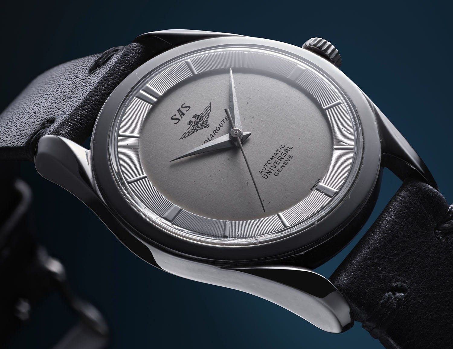
One of the big question marks around the UG relaunch, from a product and design standpoint, has always been to what extent we were going to see pure vintage-reissue / facsimile designs, and to what extent the brand might try to be a little braver and evolve from the historical designs or even launch something genuinely new. After all, one of the things you frequently hear from Universal collectors is that what got them into the brand was the sheer number and variety of different designs that it produced. There is unquestionably an element of innovation and forward-thinking in the brand’s DNA. The Polerouter itself is a perfect example of that. As Brice Goulard writes for Monochrome:
The standout feature of the Polerouter was its three-dimensional effect, achieved through a two-part design featuring a tension ring with hour markers fixed to the glass and a curved dial to secure the movement. The arrangement, patented by Universal Genève in 1953, was considered a technical and visual achievement.
This is inseparable from the bold and innovative exterior and visual design, by a 23-year-old Gérald Genta.
So, with the presentation of the 70th Anniversary models, do we now have an answer to that question? Is it going to be vintage repro all the way for the new UG?
Maybe, maybe not. I don’t think it precludes Universal Genève from branching out in the future, once it’s made sure that it hasn’t offended the UG traditionalists or collectors. And it would be quite the risk to launch with something entirely new – especially given the market’s ongoing love of vintage watch styling (and notable aversion to new designs from brands who are best known for certain classics).
So let’s reserve judgement on that front. What I do want to take a look at is the execution of these new pieces, in the context of them being very close imitations of the classic no-date twisted-lug Polerouter design.
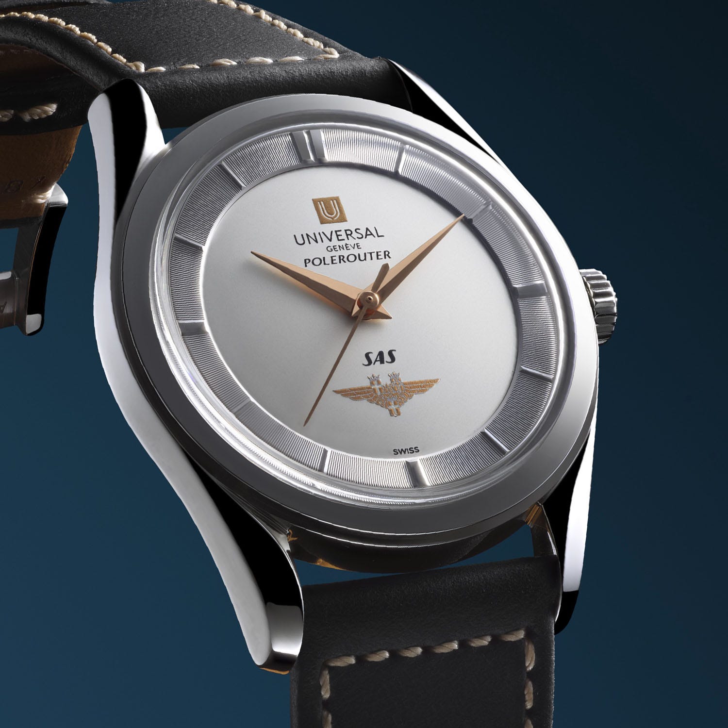
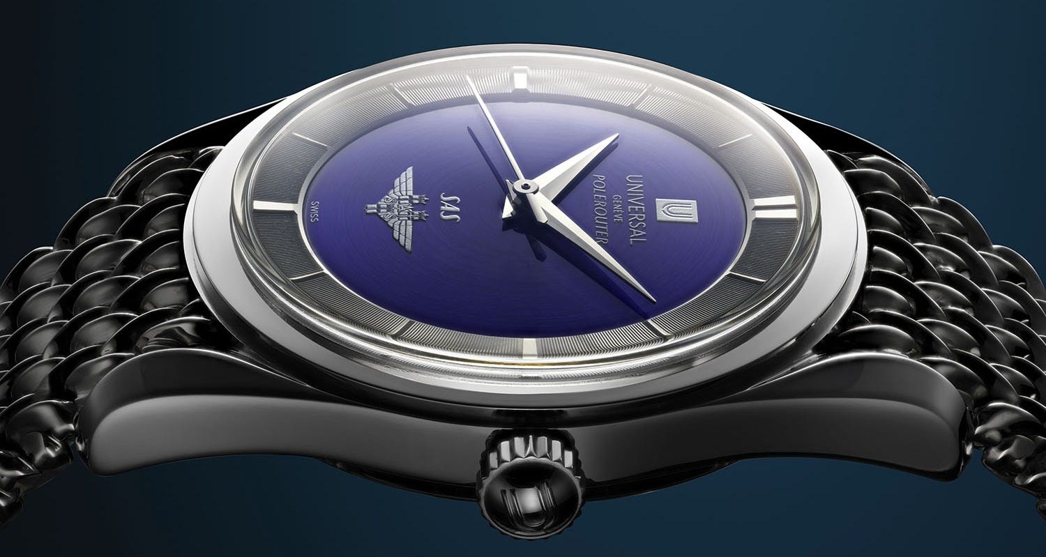
What’s immediately obvious is that these are extremely close reproductions. They use recommissioned vintage calibres and a case that is indistinguishable from the originals. The hands are also of the same design, with the same proportions and execution (the point on the counterweight of the seconds hand is one of the rarer styles that was used, but it did exist1). The raised hour ring rehaut – possibly the single most defining feature of the Polerouter design – is the one part that I think improves on the original, at least in terms of execution. The machine turning of the original has been recreated with diamond cutting, and I expect that the effect of the sharper and cleaner cuts makes a significant difference to the impression of “fineness” without deviating from the original design.
Still: so far, so virtually-indistinguishable.
Where things start to differ is in the graphics and typography.
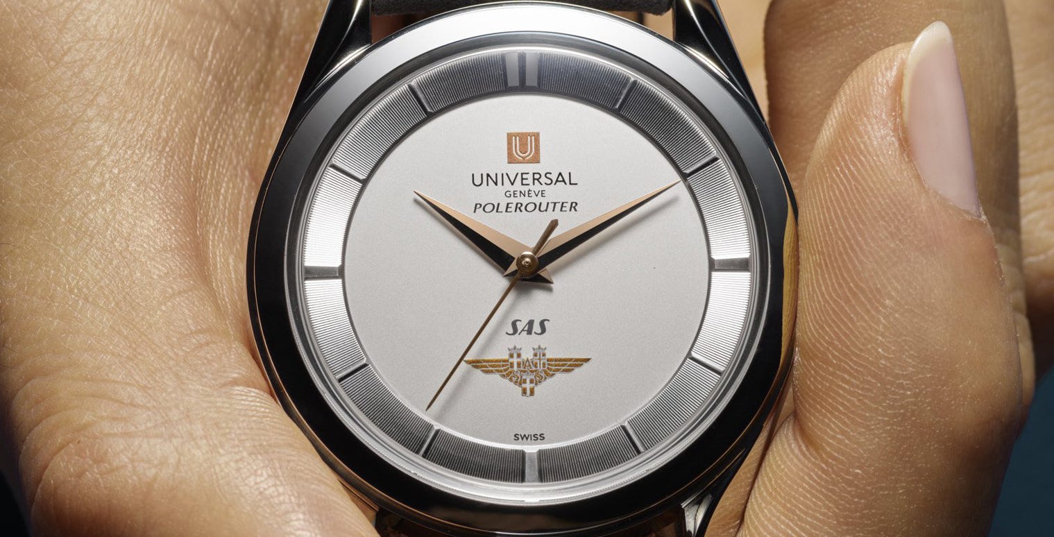
A new logo
The first incarnation of Universal Genève used many different logos. Generally, they are based on a letter U in the shape of a shield (a popular Swiss/Genevan theme that refers to the cantons’ coats-of-arms); initially, the U had a point at the bottom of the lower curve in reference to this. Later, when UG’s dial graphics became thinner and more refined, it lost the point and instead became a simple semicircular U shape framed in a square. But in addition to these basic shapes there was quite a variety of different designs – when tuning fork movements come in, there’s a tuning fork shape framing the U; there’s a fat and wide-bottomed 1960s U; there’s a version contemporary to the early U which is framed inside a pointed shield, instead of the U itself being pointed. And so on.

Most recently the logo had become something resembling a wave or flow of water, constructed from three parallel lines swooping to form the U shape. This is probably the variant that looks the least like a shield and also the variant most associated with the decline of the brand from an enthusiast perspective, so it’s perhaps odd that this is the version that the rebrand looks the most like.

What the new logo seems to be trying to do is to blend a number of different logos from UG’s past together into a new one. This isn’t an uncommon approach nowadays. It’s the natural result of a design process that includes lots of people, that is highly cognisant of the brand’s history, and that has been through many (many) rounds of iteration and sign-off. Often, unfortunately, what tends to come out of a process like that is a design that lacks punch – something that is unlikely to provoke a strong response, either positive or negative.
The decision to “invert” the point, to move it inside to the negative space, for me, diminishes it. When you see it large, you might understand what it is intended to represent. But more likely, you’ll see a filter or pipette shape - a hollow space, in which something would fall down and exit through the hole at the bottom.
It also gets fussy at small sizes. It simply looks as if the lower of the two lines is broken, for no obvious reason. However, as used on the 70th Anniversary Polerouters, I think it’s acceptable, for one simple reason: inverted, framed in a solid square, the pointed shield shape becomes positive again, and the heaviness of the square gives it some presence and authority that the standard version lacks.
The logotype (AKA wordmark) fares less well on the dial. Like the symbol, it bears the visual traits of something that has been very carefully walked through a process of rational, polite development. It takes as its starting point the curved point at the bottom of the new “U” symbol, and applies it to its terminals2 wherever it reasonably can.

This is a very common recent design trend, and one that draws quite a bit of ire from some quarters. There are any number of rebrands one can point to where all that seems to have been done is to take an unremarkable typeface and cut a few corners off here and there. The biggest issue I have with this is: all you are really doing is weakening the letterforms. No character or unique recognisability is added in this way. And when you scale it down? Yep, it all disappears anyway.
Another aspect of the wordmark is that the “GENÈVE” part is identical, in terms of style, weight3, shape etc., to the upper “UNIVERSAL” part; it has simply been shrunk down to make it smaller. The larger you reproduce the lockup4, the less this matters, but at smaller sizes you start to see the GENÈVE as much thinner/lighter in colour, and thereby unbalanced with the larger text above. It’s normal for smaller text to be a bit thinner in absolute terms but simply scaling it down looks like a digital artifact, too modern in feel for a watch that evokes the 1950s.
Having said that – I don’t want to criticise the logo too much because overall it has been sensitively and respectfully designed, and avoids copying any particular vintage logo. The kerning is mostly ok, apart from an unexpectedly wide “NI” pair. The balance and spacing of the symbol (in the square) and the logotype is solid and sits at a comfortable size on the dial.
Typography
The POLEROUTER text, on the other hand, is a little odd. It’s in a different style to the logotype, which is fine, but it’s almost not different enough. It echoes the slanted letterforms of the original but it looks like a font rather than a custom wordmark. It seems as if they tried to find a font that was as close to the original as they could (not an easy task), rather than drawing something bespoke to sit properly with the rest of the type. It’s also spaced closer to the logotype lockup than the symbol is, which feels a bit off. Perhaps that’s a consequence of the SAS branding taking over the lower half of the dial5, but I do wonder if the logotype could have been a tiny bit higher up, just to make things a little more comfortable.
Overall, the dial typography just looks a fraction imbalanced and a fraction digital. Not terrible by any means, but not a ten out of ten effort either.
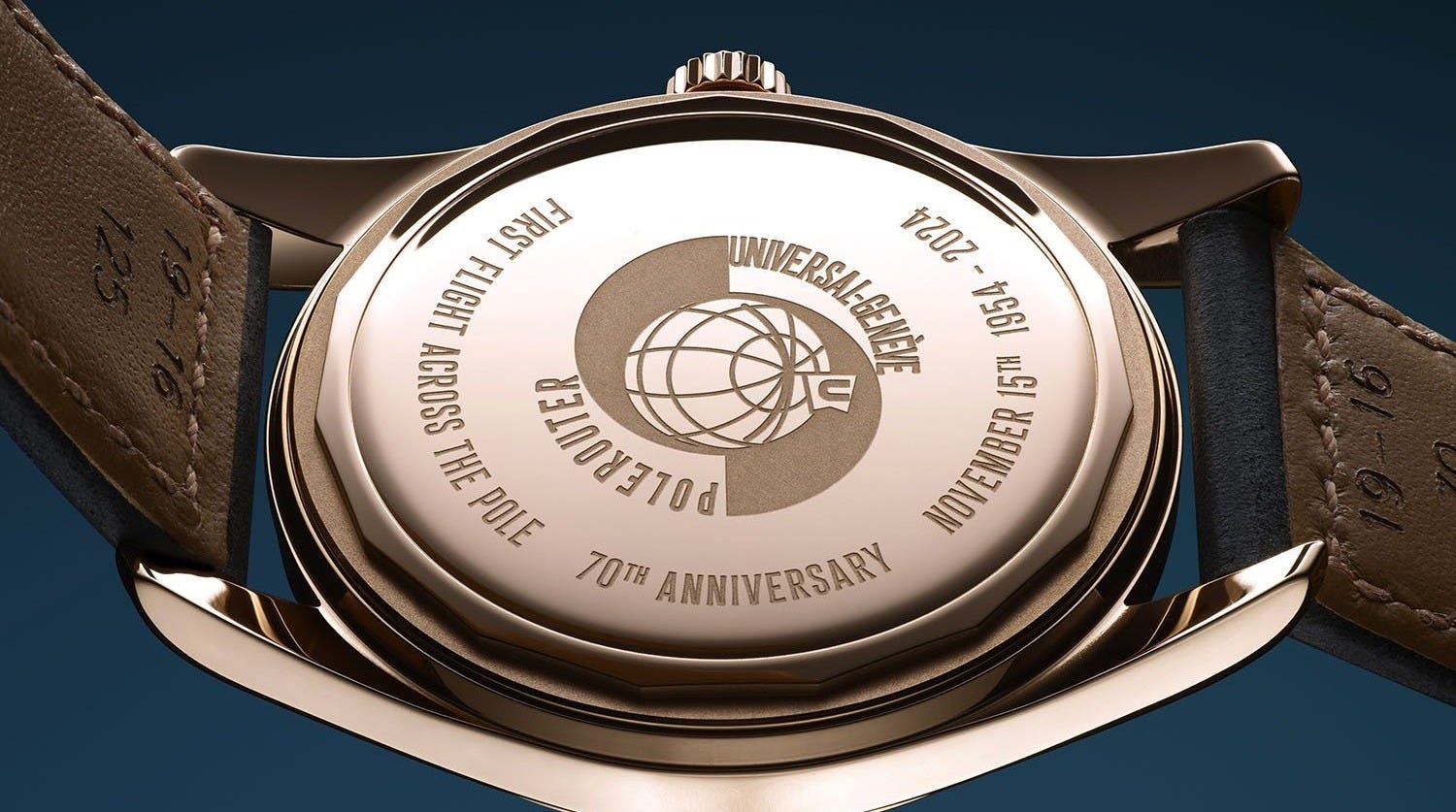
The caseback design, for me, is by far the weakest part of the whole thing. I assume the illustration in the centre has been adapted from a piece of promotional material produced at the time. It’s a bit indistinct and I think it needs to be bigger, but that’s not really the issue. The problem is the type. The “UNIVERSAL-GENÈVE” wording is distorted6 and tracked7 so tightly that the letters collide, while the “POLEROUTER” text is spaced right out. The difference between them is quite jarring.
The additional text, around the edge, also has some curious decisions in it. It’s the same style as the illustration text, but slightly lighter; this, plus its tracking, makes it different enough to look like a mistake, or carelessness. It’s either too similar or not similar enough. It also reads the opposite way around – the baseline8 of the text is towards the perimeter, rather than the centre. (Note: the large gap in the text on one side is occupied by a serial number and hallmarks that don’t exist on these images.)
Overall – it’s a bit messy and loose, and lacks the elegance of the dial side (and indeed, of the Polerouter as a whole).
A sign of things to come?
Fortunately, I don’t think the deficiencies detract too much from what is a really attractive set of watches (and you wouldn’t see the caseback on the wrist, of course). It might be that if and when a production version arrives, it would even have a display caseback.
I’m hopeful that we could eventually get some novel Polerouter variants. There were often dozens of different dial and hand configurations available at any one time from Universal, yet I’m not sure the Genta twisted lug design was anywhere near exhausted. Apart from the Polerouter Date version (the numerals of which could form the basis of a newsletter of their own), UG generally chose to produce more complicated Polerouters in other case shapes, or in other product lines entirely. But if you think about how successfully other strong Genta designs have been adapted to accept additional complications – the Royal Oak and Nautilus are the obvious examples – why couldn’t you make a chronograph or triple calendar Polerouter? Though perhaps you wouldn’t want to skeletonise something that is intended to resist magnetic forces…
That’s all for this edition. Thanks for sticking with me through this brain dump on the 70th Anniversary Polerouters. What do you think of them? Let me know in the comments and if you enjoyed this newsletter, please consider subscribing if you haven’t already.
Until next time,
Samuel
Here’s one example.
The open end of a letter stroke, where e.g. a serif might be.
The “boldness” of a typeface, i.e. how thick or thin the strokes are.
The preferred fixed arrangement of a logo / symbol and wordmark.
Though a number of SAS-branded models used a different layout, without a “U” symbol and with the SAS branding in the top half of the dial, along with “POLEROUTER” and “AUTOMATIC UNIVERSAL GENEVE” in the lower half.
Scaled along one axis more than the other; this would distort a square shape to become a rectangle, for example.
Tracking is kerning across a whole line or block of text. Kerning is (usually) the spacing between a single pair of characters.
The invisible line that the text “sits” on.
Loved reading this. Just to note, the illustration on the caseback that you mention is modeled after one of the icons that originally appeared on vintage models:
https://universalgenevepolerouter.com/the-polerouter-buyers-guide/
Though they certainly changed the tracking on 'POLEROUTER' for these updated versions, along with the entire script shape.