
Watching Type, No. 3: Digital distortion
A primer on stretching, squashing and skewing

Hello, and welcome back to Watching Type. This week, I’m taking a look at something that I’ve mentioned a few times. You could say it’s a bit of a pet peeve of mine: digitally distorted type on watches.
I thought it was time that I explain exactly what I mean when I say “digitally distorted”, and why I dislike it so much on watches in particular.
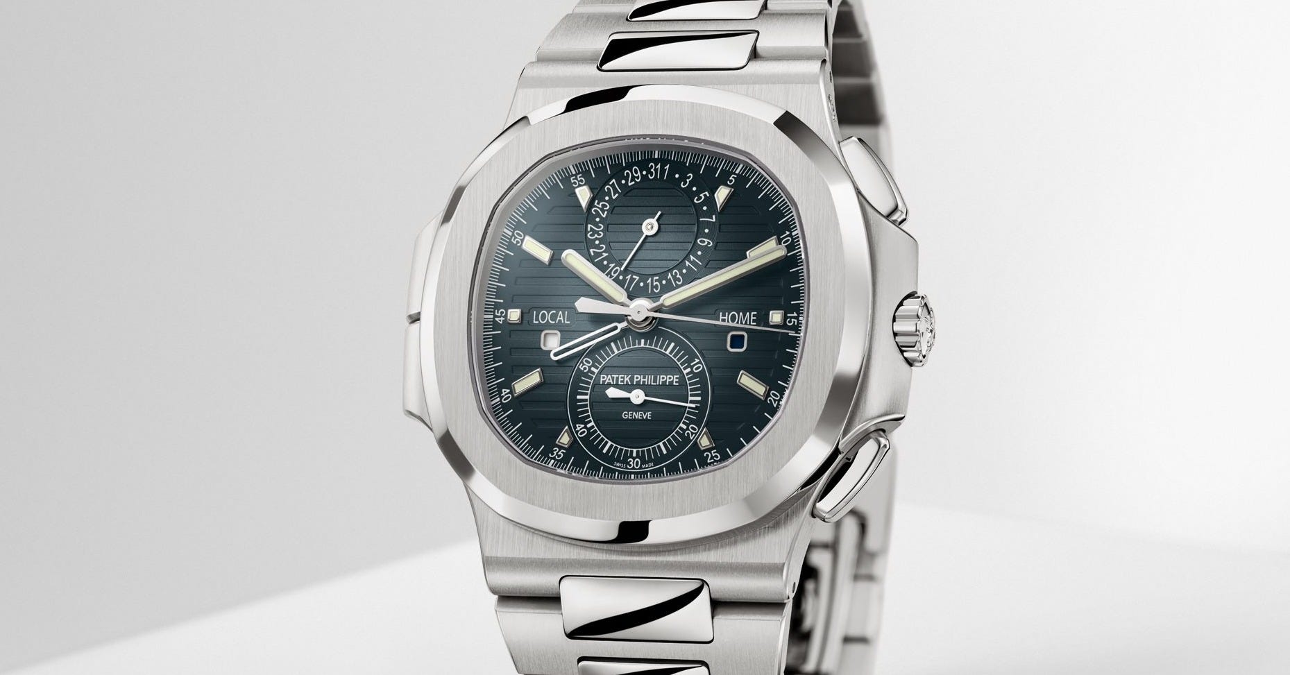
Type and typography
Let’s quickly run through how watch typography used to be created, and how it’s created now, because there’s a huge technological sea change that happens: computers.
In the old days, much as in any manufacturing field you care to think of, more or less everything was done by hand. Increasingly, technology came along that made the processes involved faster, easier, and more consistent. These technologies diminish handcraft but greatly increase speed of production and enable economies of scale, and so they win.
In the case of typography, we went from hand-written reproduction of manuscripts, to woodblock printing, to movable type, to offset lithography, to digital printing. All of those printing and production technologies affected the design and layout of the printed matter itself.
On watches, the earliest dials were for a long time hand-painted or hand-engraved onto metal and enamel, and the styles used reflected that. In the late 19th century, a significant new technology was introduced in the form of pad printing (also known as tampography, or décalque). This technique has endured through to today, with only minor changes and improvements. The main evolution has been to the method of producing the engraved plate (or cliché): from hand-engraving, to chemical engraving, to laser engraving.
But these changes in plate production techniques are minor compared to the impact of the desktop publishing revolution on the design of what is being printed. In the past, the printed design was hand-rendered. Someone had sat down and drawn, or painted, the letters and numbers – one by one. This inevitably resulted in certain styles and conventions becoming the norm for watches, in parallel to book or newspaper styles but quite distinct from them, as they used fonts in the form of movable metal type, developed for printing extended blocks of text onto paper. Watch lettering was designed for its own purposes and existed in its own context.
So when computers arrive and suddenly allow you to take centuries of wider typographic history in the form of digital fonts, to rotate it, scale it and even distort it freely, suddenly the old rules don’t exist anymore.
A tradition of selling tradition
With a few notable exceptions, what subsequently happens to watch typography is very much not what happens in print design. Graphic designers pounced on the Macintosh and its DTP software ravenously, and started producing all kinds of typographic freestyle that had never been possible before.
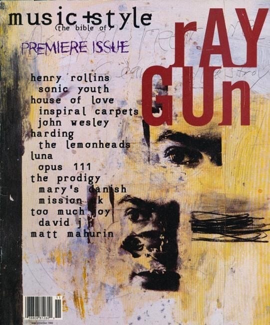
Watch brands, being quite staid, old-fashioned entities that trade on heritage and tradition, did not rush to embrace this kind of thing. The notable exception of course is Swatch – but Swatch operated far away at the other end of the market, and had to be disruptive, youthful and fashionable.
But regardless, the technology had become ubiquitous, and it was only a matter of time before the traditional dial makers such as Stern gradually faded as watch brands brought dial design (and sometimes manufacture) in-house. All the expertise of the artisans who had patiently hand-lettered dials for decades was gradually discarded in favour of someone whose primary qualification was (in all likelihood) “knows how to use a computer”.
The reason for this is, basically, “cool, now we can use these fonts to design our dials instead of paying those guys all that money”. I’ll come back to this in a future newsletter, but the proliferation of free computer system fonts like Times New Roman, Arial and Zapf Chancery on the dials of prestigious watchmakers, such as Jaeger-LeCoultre and Patek Philippe, arguably marks the point at which dial design started to “go wrong” in many people’s eyes.
Bend me, shape me
What those prestigious brands demonstrate is that, even using a computer that can manipulate fonts with ease, it’s not really that straightforward to arrange type elegantly in a confined space. Typographers know this – it takes years of education and practice to learn how to do it well. But a lot of dial design that appears today still just looks like the person that created it isn’t quite in control of what they’re doing.

Let’s compare these two Patek Philippe perpetual calendars, the (neo-?) vintage 3940 and modern 5327. The 3940 (on the left) was introduced in 1985, and during its production lifetime the digital revolution would take hold, with its dial getting progressively worse over time with later iterations. This culminates in the final insult, the “Saatchi” edition (produced in 2015 using new-old-stock cases) with a salmon dial that has digitally distorted type scattered all over it:
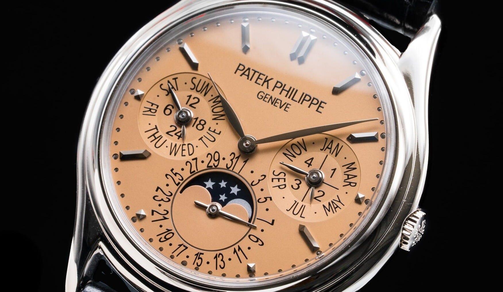
The date indication on the Saatchi is… borderline crazy, honestly. The numbers skew and stretch, ducking and leaning around the other subdials, colliding with each other and nearly falling into the moonphase. The idea of it even being symmetrical, let alone balanced, does not seem to have concerned them.
This is not good practice – show it to a teacher of typography and watch them recoil – but it’s something that Patek has wholeheartedly embraced. Photoshop typography: tap out a number, hit command-T (for transform) and drag those corners! Go wild!

The above image shows regular Arial numerals as Patek has used (again, the Arial rant is one for a future issue), distorted (as on the 29) and stretched (as on the 9). Stretched in this context means “transformed along a single axis”. The most obvious artifact of these distortions is that the letters get thinner and thicker in places that they shouldn’t.
In doing so, they immediately become quite ugly, but that’s not the only problem. The number stops looking like a number, and starts looking like a picture of a number, hanging in space at an angle to the viewer. Letters and numbers are things, not pictures of things. We read them most easily when they are presented in their best light: undecorated, unobscured, and undistorted. Think about road markings: words are painted on the asphalt in an extremely tall style precisely because, when seen from behind the wheel, they become the right height1.
Going back to the comparison between the first series 3940 and the modern 5327, we can see the stark difference. Even without analysing the reasons why, the gulf in elegance is plainly enormous. And for a watch that ought to epitomise elegance, or at least a certain type of elegance, that feels like a failure of design.
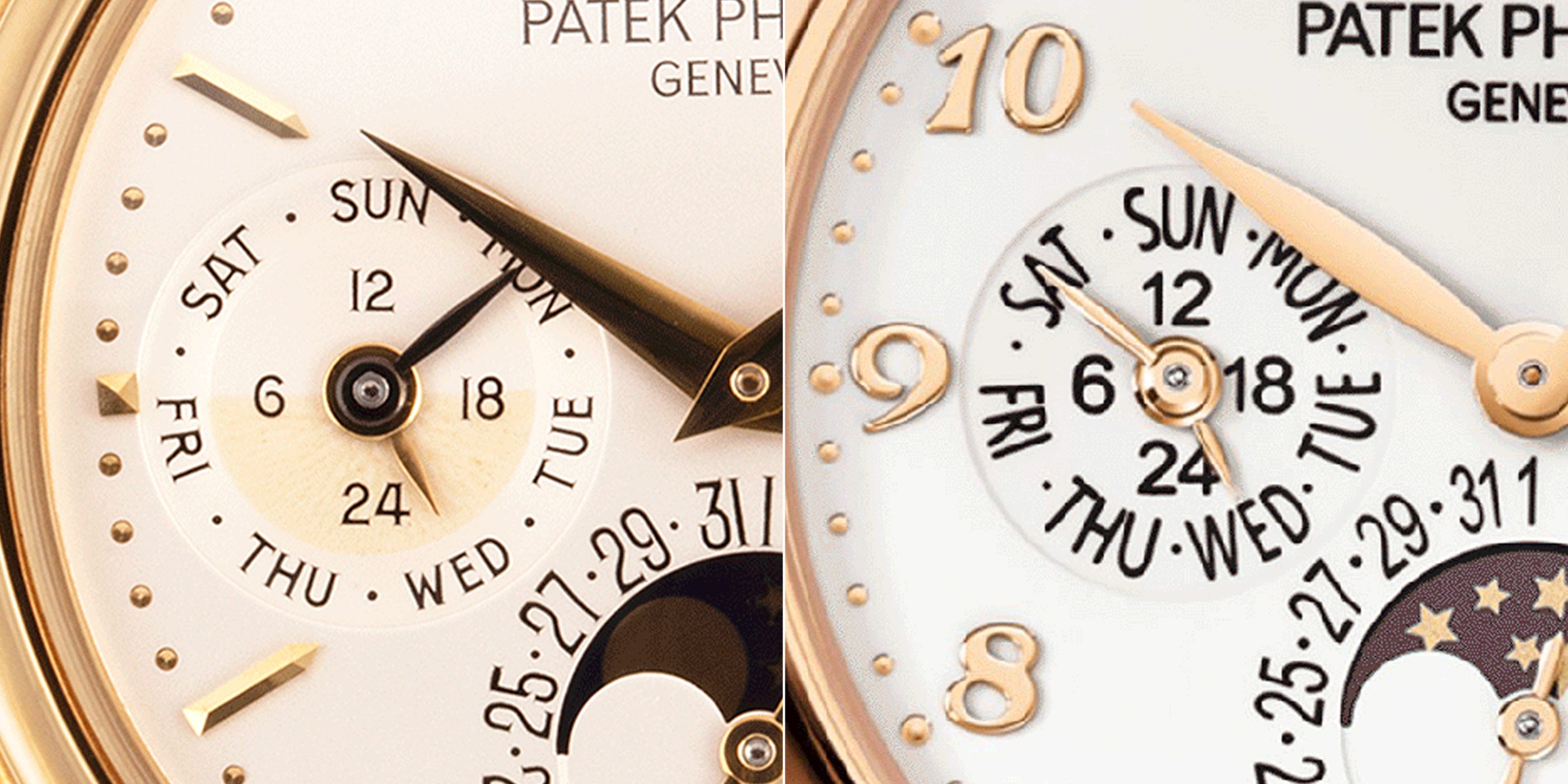
I probably don’t need to point out the myriad weird bits of typography on the 5327 – the inconsistencies in weight, width and spacing, the skewed numbers (like the 31 leaning over), “FRI” being unnecessarily condensed next to the other days, letters colliding… It’s just a mess.
I’m certainly not advocating for everything to look like a vintage watch. My personal preference is for collecting new watches, not vintage, and I’m a fan of plenty of modern designs such as the Ressence 1° (which I may well take a look at in a future issue – and no, I can’t afford to own one). Digital typography isn’t the problem; it’s the distortion, scaling, poor spacing, etc. In most cases, it’s just bad practice. The user is to blame, not the tool.
My plea to watch brands is simply to take a closer look at what you’re putting on the dial. A little care and attention from an experienced professional could make a world of difference – hopefully not only to other designers who see it, but also to the collectors who obsess over these details just as much.
That’s it for this week. Let me know your thoughts on this subject in the comments or on my Instagram. Thanks for reading, and I’ll see you next time.
Samuel
But also, it’s perfectly possible to have tall and narrow type on a watch dial (it’s necessary in many applications). When numerals are drawn by hand to be the desired height, a skilled drafter will make them look tall, not distorted. On the 3940, the date numerals have vertical sides to maintain natural curves at the top and bottom and elongate them without causing a stretched look.
Another house of horrors are the numerals on date discs. Traditionally, each date had custom typography to maximize legibility. The idea being that no one is comparing one date position, '1' say, to the previous one ('31'). Therefore the 1 is rendered quite wide.
There is at least one prestigious maker who decided to abandon this and use DTP software to create the 31 dates on their disc in the same (under)size font. Worse is the kerning...